Begin with the working set
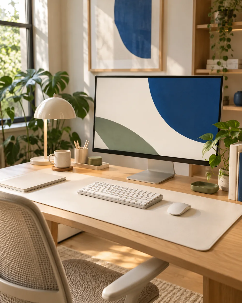
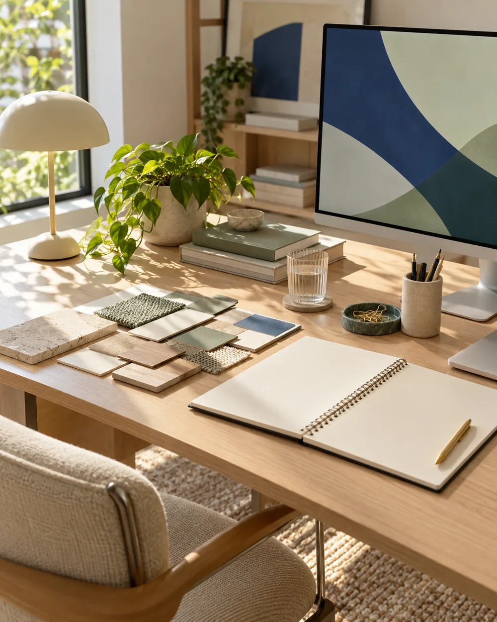
Choose a consistent ordinary light source and a clean surface. Set out the actual desk objects or suitable material samples without private labels or personal paperwork.
Compare one visual change
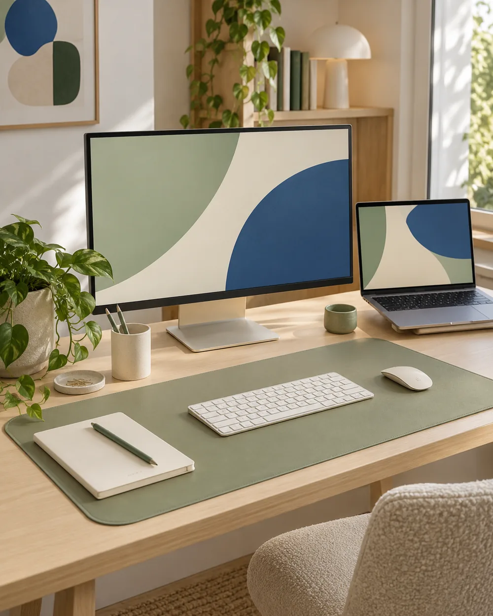
Take one overview showing relative areas and one closer image showing the surfaces. Avoid strong filters that make unlike colors appear artificially identical.
Observe the actual arrangement
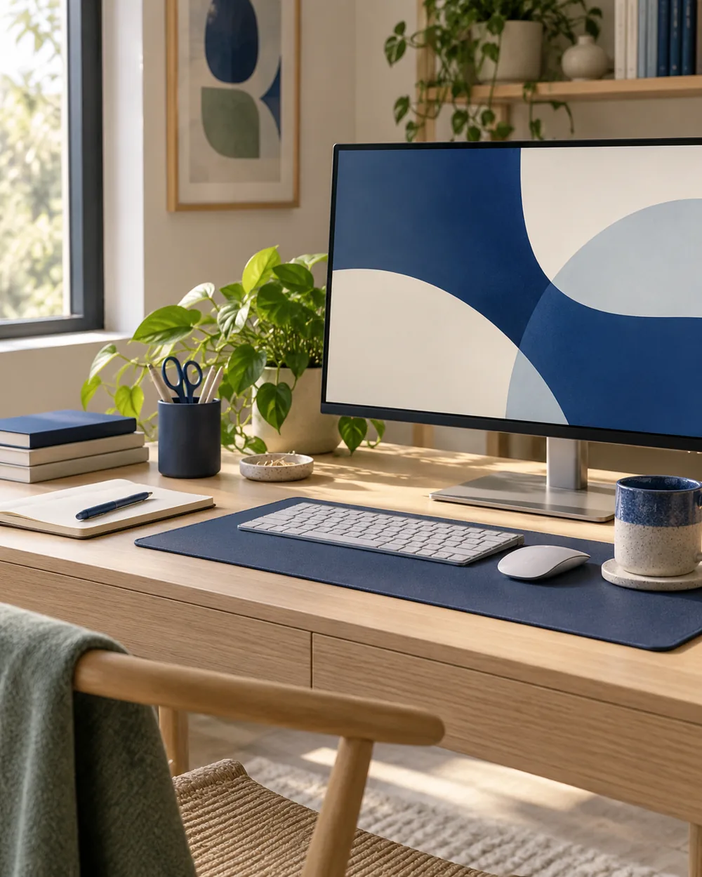
Write the light conditions and physical item references in a private note. If a color appears different later, record that observation rather than editing every photo into a false match.
Keep a useful reference
Keep the record as a memory aid, not a color standard. Before a purchase or care decision, check the physical object and reliable product information rather than relying on a saved palette image.
A couple of useful questions
Do I need to buy the objects in the picture?
No. The AI image is an editorial concept, not a product listing. Begin with your own suitable objects and actual dimensions.
Is this a tested equipment or health recommendation?
No. These are visual planning notes, not product tests or prescribed ergonomic settings. Use the actual maker instructions and your own requirements for equipment decisions.